Cover: 1st Draft
- Nathalie Gross
- Apr 3, 2023
- 3 min read
In this post, I will be sharing my drafts for my magazine cover and discoing my thoughts about them. I will also be identifying how my cover uses conventions of a fashion magazine, as well as how it challenges these conventions.
Cover photo one:

To create this cover, I have used Canva. Canva has provided me with lots of templates to choose from, as well as an easy way to edit the templates as much as I want. This allowed my vision to come to life. In this photo, I chose to use the image where my model is wearing the color pink. I incorporated this color in my masthead, main cover line, and in some extra detail throughout my magazine cover. I did this to help to magazine stand out more and garner more attention. The font used for every piece of text on this cover is EB Garamond. I particularly like this font as it is a classy Serif font that isn't too playful, large, or overpowering. The reason I specifically chose this image as my cover photo because there is a lot of room to include my main cover line and the rest of my cover lines on the side without being to busy as taking away from the photo. The cover lines were in white as there wasn't a lot going on in the cover so it wasn't difficult to see, it was also bolded which helped it stand out. In fact, I adds a lighter feeling to the magazine. On the bottom right I included a barcode and on the top left I wrote the dateline in white as well so it would match the rest of the magazine.
Cover photo two:
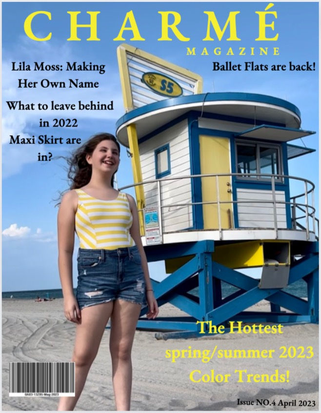
I used Canva to create this cover. In this cover, I decided to change the bright pink color scheme too bright yellow. This can be seen in the blocking I purposefully set up between the bathing suit top of the model and lifeguard structure in the back, and in the masthead and cover lines. This cover was a bit busier, but I wanted to see how it would look in comparison to to more calm cover I create first. I also took out a few brief descriptions I had underneath a few magazine cover lines as there isn't as much room. Furthermore, I changed the formatting of where I placed these cover-lines by moving one to the other side to fill up a much space as possible to see how a different format would look. Overall I wanted this cover to be packed with text and more the redactions a joyful and exciting feeling. The text, once again, is all in EB Garamond but the cover-lines are bolded in black because white would have been too difficult to see, and the black stands out more. I included a barcode on the bottom left and the dateline on the bottom right in the same black color as the cover lines so it matched the rest of the magazine.
Conventions throughout my covers: The Masthead I used is bigger than the rest of the text to show that it is the name of my magazine. My main cover line, when compared to the rest of my cover lines, is in a bigger font and the same bright color as the masthead, showing that it is "more important" and more distinct. In other words, it stands out. However, in both of these magazines, the model is not a famous person that would initially attract a ton of people to buy this magazine. The models face is also not covering the masthead which is a common feature in a fashion magazine, challenging popular conventions. I have done this so the masthead is as clear to read as possible. More specifically in the first photo, by not overlapping these two items, there is a calmer and more relaxed look, which is the feeling I want for people reading my magazine as these photos were shot at the beach for a summer feeling. However, usually there is a lot more text in a magazine and bigger fonts used in a masthead, challenging conventions. The second photo is more similar to these conventions as it is feels busier and more jam packed.


Comments