Table of Contents: Final
- Nathalie Gross
- Apr 8, 2023
- 3 min read
Updated: Apr 10, 2023
In this post, I have displayed my initial drafts of my table of contents and my final table of contents. To add, I have reflected upon this process and made comparison between the drafts I created and the final version of my table of contents.
First draft:

First draft(second version):

Final Table of Contents:

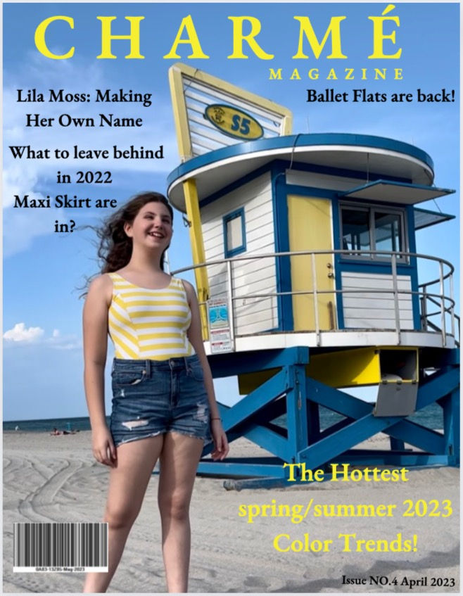
Program used: Canva
When reflecting on my table of contents, I realized how stumped I was in the begging of this process. I have seen a ton of magazine covers and read many articles, but I usually always skipped past the table of contents and found the articles that I wanted to read on my own. Through Media Studies, I was able to grasp more of concept as to what I needed to due to create a TOC. While this was helpful, I still wasn't 100% clear on what I should do, so I decided to challenge conventions. For example, I decided to include an editors note on the same page as my table of contents. After writing that, I felt more comfortable and played around with how I wanted to format the photos that were going on that page. In fact, it took some time to pick which photos would look best on each page of my magazine and how I could align the colors of the clothes with the text or layout design of each page.
When looking at my initial draft, there are some very clear distinctions of that compared to my final TOC. For instance, the very first draft did not include an editors note as I was unsure of what to include on this page officially. In my final TOC, I did end up including a TOC. The color of the name of my magazine, Charmè, was yellow, aligning with the photo on the top right. This is instead of the pink font in my final magazine, correlating with the bottom left photo. Additionally, in the first draft I created, the articles were in black, there was no color. In my final magazine, the articles are in a bright pink to match the word Charmé. I realize now that it would have been increasingly hard to read if I sticked with the yellow color and made my articles in that yellow color. Moreover, in my first draft the words table of contents were not next to where I displayed my articles and there page numbers. In the final version, I moved down that text so that it was directly over where the TOC was. My second draft was very close to my final magazine, but there were still some changes that I made after receives feedback. To illustrate, the words editors note was small and on the same lioness the rest of the text. In the final magazine TOC, the words Editors note is now a title on it's separate line and in a bigger font. What I didn't notice until the point was how the page number on the table of contents did not match the color or font of the rest of the page numbers in the double page spread. Due to this I fixed it for my final magazine. Continuing on, what is the same between the drafts and the final magazine is the photos used, photo placement, names of articles/page numbers, and the incorporation of my magazines name.


Comments