Magazine Cover: Final
- Nathalie Gross
- Apr 8, 2023
- 2 min read
Updated: Apr 10, 2023
In this post, I will share my original drafts of my cover as well as the final cover I have created. I will also reflect on this process and the comparisons between my drafts and final creation.
First draft:
First draft(second version):

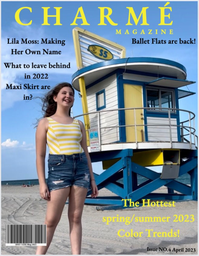
My final magazine cover:

Software used: Canva
This process was a long and insightful one. Throughout the year I have researched and analyzed many covers, helping to make mine appeal to a wide range of people. I did this through the use of conventions that are commonly found in fashion magazines. This includes increasing the font size of text that is more important, incorporating playful and bright colors as well as following a color scheme, and more. Adding the barcode and dateline was truly the cherry on top of this cover, making it all feel real. Similary, this helped me realize how important the small details are, and paying attention to everything. Towards the end of making my cover and looking back at what I had created, I am very grateful to have learned what I did as there are many skills that I have gained. This includes photography which helped my cover truly stand out and something I wouldn't be able to do before taking this class.
The first draft on this post was the one I wanted to go with initially between the two I had created. Compared to my final magazine, I changed the color scheme from yellow to pink, the placements of where I put the cover lines, barcode, dateline, as well as the photo I used. After receiving some feedback, I ended up going with the draft below. This draft was pretty close to what my final magazine ended up looking like. However changes were made as there is always room for improvement. When comparing the two, it can be seen that I moved up the masthead so there wasn't a lot of empty space, made the cover lines more structured to look more professional and put together, and reduced the size of the barcode so it wasn't taking away from the overall cover regarding the photo and cover lines. This draft just felt unfinished and there needed to be some more focus on the details. Overall, the final magazine I created still had a lot of the original elements of my initial ideas and thoughts but also incorporated the opinions of others to make my cover the best it could be. What is the same between the second version of my first drafts and the final magazine is the color scheme, photo used, placement of the dateline and barcode, and the name of the main cover line and names of the cover lines.


Comments