Double Page Spread: First Draft
- Nathalie Gross
- Apr 3, 2023
- 3 min read
In this post, I have created two separate drafts for my Double Page Spread. Included is my article along with photos from my final photoshoot. I also wrote about my process and thoughts behind the creation of these spreads. Lastly, I discuss conventions that I use and challenge thought this experience.
Double page spread one:
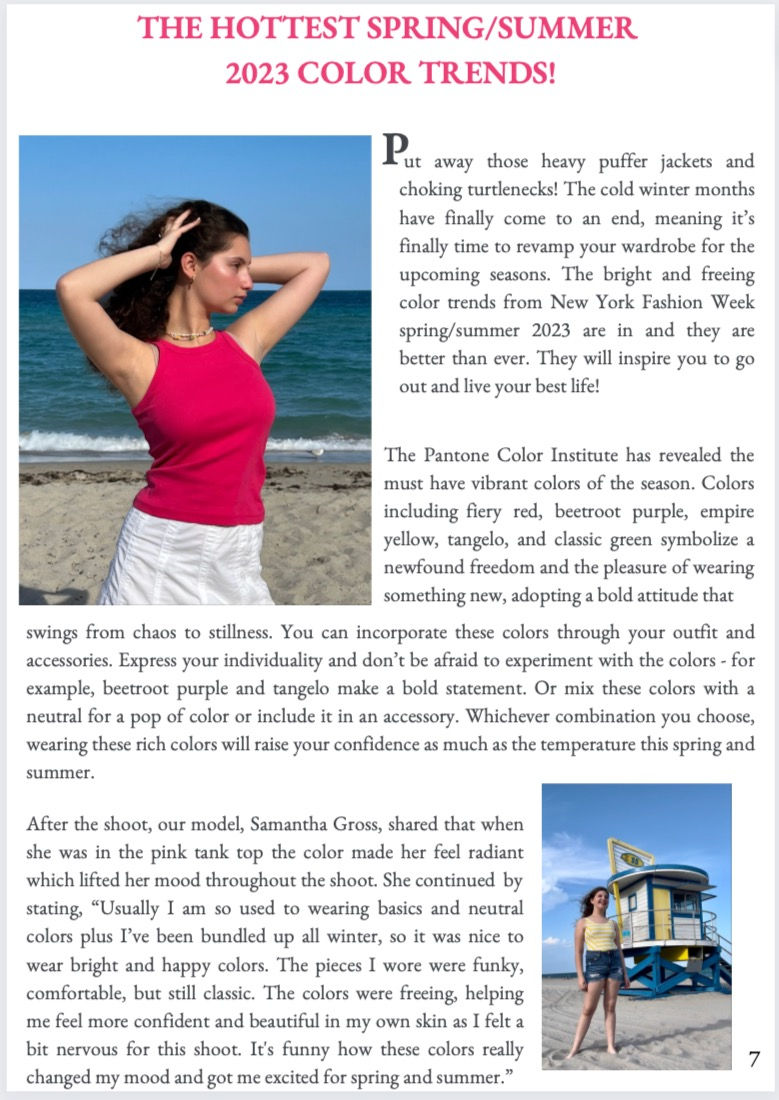

In the first DPS that I created, the first page's title was in the same pink color I used in the drafts form my cover and TOC. it only makes scene that I include this hue here as well. I tie it in by showcasing a photo on the right hand side of the model wearing a top that color, the same outfit she wore on the cover. To "spruce" up this page, I made the first letter of the text bigger and bolder than the rest, Continuing to make my spread pleasing, I made sure that the margins of each paragraphs was the same, giving nice clean edges to them. Moreover, I separated each paragraph a little bit so that the amount of text was not so overwhelming. Lastly, I included another photo on the bottom to once again break up the text and provide more color. In the second DPS that I created, I made almost a checkered pattern with my text and photos to make it more fun and creative. This hopefully would engage more readers. Continuing on, on the bottom right hand side of the page, I included a pull quote. I did this so that if a person was flipping through the magazine and maybe didn't want to read the whole article, this quote will jump out at them and catch their attention. This might change there mind about not wanting the read the article as they are now curious to what it's about. In the word pop from the pull quote, I bolded it and made it to a similar color yellow as the sweater to further capture the attention of many. Lastly, I included the page numbers on the bottom of the page. I created this using Canva.
Double page spread two:


In the second DPS I created, I wanted to go for a simpler and more classic look. For example, in the first page, I did not make the title of the article in a color. I also took away the first letter of the article from being bolded or enlarged so that the entire article was "cohesive" with each other. To reduce taking up extra space, I got rid of the extra space placed between each paragraph. The photos I sued remained the same and in the same layout, however. In the second page, I got rid of the pull quote to make the page as clean as possible without contrasting text that is in other colors and/or bolded. I also got rid of the names of people in the photograph on the top right to get rid of as many words as possible, however I am certain I will add that back in. Overall this page was emptier than the first draft I created of this same page. To add, the margins are the same as in the first draft I created, and the formatting of the text and photos remained the same. To create this, I used Canva.
Conventions: In most fashion magazine I have researched throughout this year, I found that the first letter of the paragraph is bolded and enlarged. This is a convention I have used in my first draft of the DPS. I have also seen the use of colors incorporated in the text on a double page spread, which is also what I have done in my first draft as well as the use of a pull quote to draw readers into the fashion magazine. Another convention I have used is the margin spacing to make my text look neat. However I find myself challenging conventions as most DPS's I have come across in the fashion genre take up an entire page for one or a few photos. I played with formatting to fit multiple pictures on both pages instead of having just one photo or multiple photos on just one page. Also, I attended an trading show with Barry Gross and included the photo from there. This can be seen as challenging conventions as it may not be common to include photos featuring the editor in the double spread spread.

Comments