Masthead Design
- Nathalie Gross
- Mar 15, 2023
- 2 min read
Updated: Mar 16, 2023
In this post, I will be sharing my final magazine masthead design that I drew out. I will then discuss my design choices and the color used.
Hand drawn:

Digital creation:

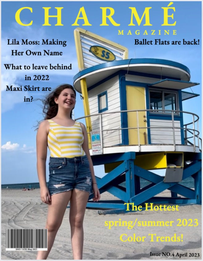
Design Choice: The font I used is EB Garamond. I chose this because of the classiness and simplicity of it. The reason I went with a Serif font is because it creates a fancy and elegant look. Furthermore, Charmé is bigger so that it will catch the attention of many. Over time, this name would become widely known. I also tried spacing out the letters to further make the work easy to read. Handrawing this made it difficult to space out the letters but creating a digital version made it easier. I might even make the spaces bigger when creating my final magazine. I used a kerning game on Kern Type to help get myself in the practice of figuring out how to properly space out the letters for my masthead. Within a couple tries, I got the hang of it. This will benefit me in the near future. Additionally, I made the word magazine smaller so that words would not take over the photo (less wordy) that would be displayed on the cover as that is the main thing I want my viewers to be looking at. Overall, creating the digital version of my masthead on Google Presentation helped me figure out how I would layout not only the masthead but the photo and cover lines that will be displayed on this page. It helped me with this as I now know how much space I will have to layout these components, it also got me thinking where I can put them on my magazine.


Color: The color I used is a bright pink, as that is one of the main colors I will include in my magazine. I also plan for one of the clothing pieces in the cover photo to be almost if not the same shade of pink as the one I will use for my masthead. This bright color is another contributor to helping my magazine pop and stand out, gaining attention from many.


Comments